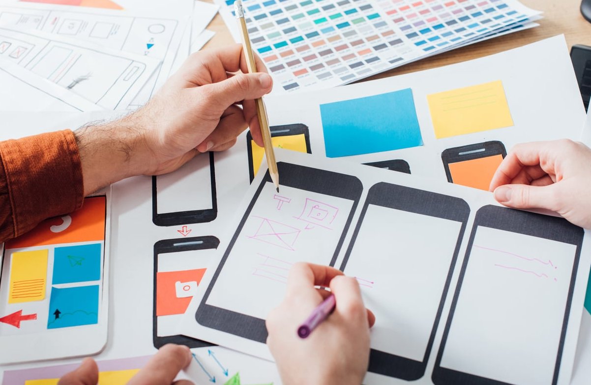
Your logo is often the first thing a customer sees, and the last thing they remember. Yet for many small business owners, briefing a designer or evaluating a logo feels like guesswork. The good news? Strong logos are not magic. They follow a handful of logo design principles that have stood the test of time.
This guide breaks down the core rules of effective logo design with practical small business examples, so you can confidently judge a draft, give better feedback, or decide if a redesign is worth the investment.
Why Logo Design Principles Matter for Small Businesses
Big brands have entire teams polishing every pixel of their identity. As a small business, you don’t have that luxury, but you face the exact same challenge: standing out, looking professional, and being remembered. A logo that ignores fundamental design principles will cost you in ways that are hard to measure: lost trust, weaker recall, awkward printing, and constant redesigns.
Think of these principles as a checklist. If your logo (or your designer’s proposal) ticks each box, you’re in good shape.

The 5 Core Logo Design Principles
1. Simplicity
Simple logos are easier to recognize, easier to remember, and easier to reproduce. Think Nike’s swoosh, Apple’s bitten apple, or Target’s bullseye. None of them tell the full story of the brand, and that’s the point. They give your brain something easy to latch onto.
Small business example: A local bakery called “Flour & Stone” doesn’t need a detailed illustration of a wheat field, an oven, and a rolling pin. A clean wordmark with a single stylized wheat stalk does the job better, prints cleaner on packaging, and looks sharp on a 32px favicon.
Quick test: Can you describe your logo over the phone in one sentence? If not, it’s probably too complex.
2. Memorability
A memorable logo sticks in the mind after a single glance. This usually comes from a unique shape, a clever twist, or an unexpected combination of two ideas.
Small business example: A dog-walking service called “Pawsitive Steps” used a paw print where the toes form footprints. It’s simple, on-brand, and instantly memorable. Compare that to a generic clip-art dog silhouette, and you immediately see the difference.
Memorability does not mean “loud” or “weird.” It means distinct. Ask five people to sketch your logo from memory after seeing it once. The results will tell you everything.
3. Scalability
Your logo will live everywhere: a website header, a phone screen icon, a business card, a vehicle wrap, an embroidered polo shirt. It must look just as good at 16 pixels as it does on a 3-meter banner.
This is why professional designers work in vector format (SVG, AI, EPS) rather than pixel-based files (JPG, PNG only).
| Use case | Approximate size | What to check |
|---|---|---|
| Favicon | 16 x 16 px | Still recognizable? |
| Business card | ~1 inch wide | Details still readable? |
| Storefront sign | 2+ meters wide | Still clean and balanced? |
| Embroidery | ~2-3 inches | Works without thin lines? |
4. Versatility
Versatility means your logo works in different contexts, formats, and color modes. A truly versatile logo should look great:
- In full color
- In black only
- In white on a dark background
- In a single ink for stamps or merchandise
- Horizontally and stacked (a primary and secondary lockup)
Small business example: A coffee roaster might need a horizontal logo for the website, a circular badge for the cup lid, and a one-color version for the burlap bean bags. A good designer delivers all three from day one.
5. Timelessness
Trends are tempting. Gradients, neon glows, ultra-thin geometric serifs, AI-generated mascots… they look fresh today and dated in 18 months. A timeless logo focuses on shape, balance, and meaning rather than chasing the trend of the year.
FedEx redesigned its logo in 1994 and still uses essentially the same mark today. That’s the kind of longevity to aim for, even at a small business level. Every redesign costs money, momentum, and brand equity.
Bonus Principles That Separate Good From Great
Appropriateness
Your logo should match your audience and industry, but not in a literal way. A law firm doesn’t need a gavel. A dentist doesn’t need a tooth. The tone, typography, and color palette should signal who you are, more than the imagery itself.
Originality
Avoid template logos and clip art. Beyond legal risks, generic logos make your business look generic. Run a reverse image search on any proposed logo before you sign off.
Balance and Proportion
Spacing, alignment, and visual weight matter. A logo that feels “off” usually has a balance issue, even if you can’t pinpoint it. This is exactly where a trained designer earns their fee.
How to Brief a Designer With Confidence
Now that you know the principles, here’s how to use them in a real briefing conversation:
- Describe your business in one sentence. What you do, who you serve, and what makes you different.
- List 3 adjectives that should describe the brand (e.g., warm, reliable, modern).
- Share 3 to 5 logos you admire and explain why, focusing on principles (“It’s simple and works in one color”) rather than taste (“I like blue”).
- Specify all use cases. Website, vehicle, packaging, embroidery, social avatar, etc.
- Request the deliverables you need: vector files (SVG, AI, EPS, PDF), PNG exports, a one-color version, a reversed version, and a brand guide with safe-zone and minimum size rules.
How to Evaluate a Logo Proposal
When your designer presents a draft, run it through this quick checklist:
- Is it simple enough to describe in a sentence?
- Is it distinct from your competitors?
- Does it work in black and white?
- Does it stay clear at favicon size?
- Does it still feel right in 5 years, not just today?
- Does it match the tone of your business?
If the answer is yes to all six, you have a strong logo on your hands.
Common Logo Mistakes Small Business Owners Make
- Designing it themselves in a hurry using free tools, then having to redo it 12 months later.
- Cramming too much into the mark: tagline, founding year, location, three icons, two fonts.
- Following trends blindly like overusing AI gradients or trendy 3D effects in 2026.
- Ignoring file formats and ending up with only a low-resolution PNG that can’t be enlarged.
- Skipping the trademark check before printing 5,000 business cards.
Final Thoughts
A great logo isn’t about artistic genius. It’s about discipline. Simplicity, memorability, scalability, versatility, and timelessness are the five pillars that separate professional identities from forgettable ones. Apply these logo design principles as a filter, and you’ll make smarter decisions whether you’re starting fresh, refining a draft, or planning a rebrand.
At The Crazy Pixel, we help small businesses build identities that hold up in every format, on every screen, and across every season of growth. If you’re ready to brief a designer or get a second opinion on your current mark, we’d love to hear from you.
FAQ
What are the 5 principles of effective logo design?
The five widely accepted principles are: simplicity, memorability, scalability, versatility, and timelessness. Some designers add appropriateness and originality as essential complements.
What are the 7 elements of a logo?
A logo typically combines seven elements: shape, line, color, typography, space, texture, and balance. How these elements interact defines whether the logo feels professional or amateur.
How much should a small business spend on a logo?
It varies widely. A freelance designer typically charges between 300 and 2,500 dollars for a complete logo package, while branding agencies can charge significantly more. Avoid the cheapest option, but you don’t need to overspend either. Focus on quality and proper deliverables.
Should I use AI tools to design my logo?
AI logo generators can be useful for brainstorming or for very early-stage businesses on a tight budget. However, they often produce generic results, lack originality, and rarely deliver proper vector files or brand guidelines. For a logo that will represent your business for years, working with a human designer is still the safer bet in 2026.
How often should I update my logo?
If your logo follows the principles outlined above, you shouldn’t need a major redesign for 8 to 15 years. Light refreshes (modernizing typography or refining proportions) every 5 to 7 years are more common and less risky than full overhauls.
What file formats should I get from my designer?
Always request vector formats (SVG, AI, EPS, PDF) as the master files, plus PNG exports in different sizes for web and social media. You should also receive black-only, white-only, and full-color versions, ideally accompanied by a short brand guide.