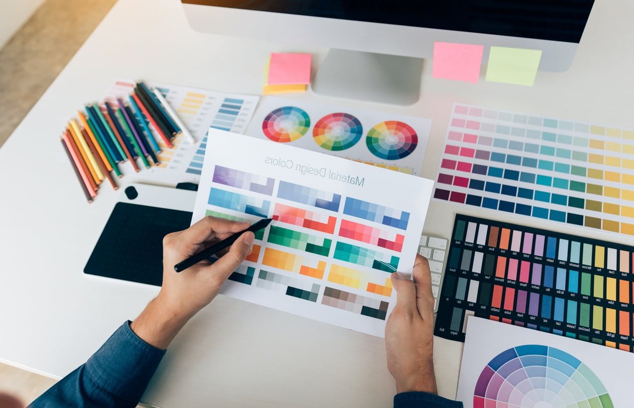
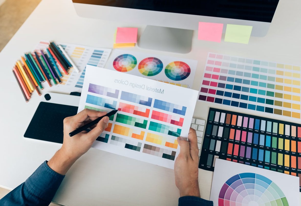
Picking the right brand colors for a local business is more than a design decision. It shapes how customers feel the moment they see your storefront sign, your van, your menu, or your Instagram feed. In this practical guide, we break down how to choose brand colors for business success using a clear framework built around industry psychology, competitor differentiation, and accessibility, with real examples from local businesses you might recognize on your own street.
Why Brand Colors Matter More for Local Businesses
National brands have massive ad budgets to teach customers what their colors mean. Local businesses don’t. That means your color palette has to do heavy lifting from day one: standing out from the shop next door, signaling what you sell, and staying readable on a small business card or a phone screen.
Research from various marketing studies consistently shows that color can boost brand recognition by up to 80%. For a local bakery, plumber, or law firm, that recognition is the difference between being chosen and being scrolled past.

A Step-by-Step Framework to Choose Brand Colors
Step 1: Define Your Brand Personality in 3 Words
Before opening any color tool, write down three adjectives that describe how you want customers to feel. Examples:
- Cozy coffee shop: warm, welcoming, artisanal
- Family dental clinic: trustworthy, clean, friendly
- Premium landscaping company: reliable, refined, natural
These three words become your filter for every color decision that follows.
Step 2: Match Colors to Industry Psychology
Different industries lean on certain color families because customers already associate them with specific feelings. Use the table below as a starting point, not a rulebook.
| Industry | Common Colors | Psychological Effect |
|---|---|---|
| Healthcare & Wellness | Blue, soft green, white | Trust, cleanliness, calm |
| Restaurants & Cafés | Red, orange, warm yellow | Appetite, energy, warmth |
| Legal & Financial | Navy, burgundy, gold | Authority, stability, expertise |
| Beauty & Salons | Pink, rose gold, black | Elegance, femininity, luxury |
| Home Services | Blue, orange, dark gray | Dependability, action, professionalism |
| Eco & Organic | Earth green, beige, brown | Nature, honesty, sustainability |
Step 3: Study Your Local Competitors (and Pick a Different Lane)
This is the step most generic guides skip. If every plumber in your town uses blue and white vans, you have two choices:
- Own the category color with a sharper, more memorable shade (think a deep electric blue instead of a generic navy).
- Break the pattern with a bold contrast color, like a plumbing brand that goes black and lime green.
Quick exercise: Google your service plus your city, screenshot the top 10 logos, and lay them on a single board. Whatever color is missing is your opportunity.
Real Local Examples
- A neighborhood bakery in Lyon chose dusty pink and charcoal instead of the usual brown and cream, instantly standing out in food delivery apps.
- An independent gym in Austin dropped the typical red-and-black formula for matte black and safety-yellow, mirroring industrial equipment and feeling more authentic to their CrossFit audience.
- A family law firm in Montreal moved away from navy to a warm forest green, signaling empathy in a field dominated by cold, corporate tones.
Step 4: Build a Balanced Palette (The 60-30-10 Rule)
Most strong local brand palettes follow a simple structure:
- 60% dominant color (often a neutral like white, cream, or charcoal)
- 30% secondary color (your main brand color, the one people will remember)
- 10% accent color (used only for calls-to-action like “Book Now” buttons or sale tags)
Keep the total to 3 or 4 colors. More than that and your signage, social posts, and printed flyers start to feel chaotic.
Step 5: Test for Accessibility
Accessibility isn’t optional in 2026. Around 1 in 12 men has some form of color blindness, and many of your customers will view your brand on a phone in bright sunlight.
Quick accessibility checks:
- Run your text and background combinations through a free WCAG contrast checker. Aim for a ratio of at least 4.5:1 for body text.
- Test your palette in grayscale. If your accent color disappears, it won’t pop on printed materials either.
- Use a color blindness simulator (most design tools now have one built in) to check that your call-to-action stays visible.
Step 6: Validate in the Real World Before You Commit
Before printing 500 business cards or wrapping a vehicle, mock up your colors in real contexts:
- Your storefront sign at day and night
- A social media post next to competitors
- A business card held in someone’s hand
- Your invoice or receipt template
- A Google Business Profile preview
If the palette still feels right across all five, you have a winner.

Common Mistakes Local Business Owners Make
- Choosing colors based purely on personal preference instead of customer perception.
- Copying a national brand color scheme that doesn’t match the local market.
- Using too many colors, which dilutes recognition.
- Forgetting print versus screen differences (RGB on screens, CMYK on print, Pantone for signage).
- Never documenting the palette, so each new flyer or post drifts further from the original.
Tools We Recommend in 2026
- Coolors.co for generating and locking palette variations
- Adobe Color for accessibility and color harmony checks
- Khroma, an AI tool that learns your preferences
- Realtime Colors for previewing palettes on real website layouts

Final Thoughts
Choosing brand colors for a local business is part psychology, part strategy, and part gut feeling. Follow the framework above and you’ll end up with a palette that not only looks good but actually helps customers remember you, trust you, and choose you over the competitor next door.
Need help building a complete visual identity for your local business? The team at The Crazy Pixel designs brand systems that stand out locally and scale beautifully. Get in touch and let’s make your brand impossible to forget.
FAQ: Choosing Brand Colors for Business
How many colors should a local business brand have?
Three to four colors is the sweet spot: one dominant neutral, one main brand color, and one or two accents. Fewer feels flat, more feels chaotic.
Can I change my brand colors later?
Yes, but rebranding is costly. You’ll need to update signage, vehicles, packaging, uniforms, and digital assets. It’s far cheaper to take the time and choose well the first time.
Should my brand colors match my industry?
Use industry norms as a baseline so customers instantly understand what you do, then differentiate within that lane. Total reinvention works only if you have the budget to educate your audience.
Do brand colors really affect sales?
Yes. Color influences perception of value, trust, and urgency. The right accent color on a “Book Now” button can measurably improve click-through rates on a local business website.
What’s the difference between RGB, CMYK, and Pantone?
RGB is for screens, CMYK is for printing on paper, and Pantone is a standardized color matching system used for consistent results across signage, packaging, and merchandise. Define your brand color in all three formats from the start.